It is such a well-known logo that many people don’t realize that anyone ever designed it. In 1976, graphic designer Milton Glaser scribbled four characters, I❤️NY, in the back of a taxi with a red pencil. Just after a distraught tourist office director asked for advice on how to lure tourists to a city plagued by high crime and a related bad image.
There is no other city logo more successful and more famous than I❤️NY. And more often imitated. New York has filed 3,000 lawsuits for plagiarism. But the city is talking about it: it is an optimistic logo that now belongs to New York as much as the Empire State Building.
Glaser, born in 1929 in the Bronx borough, died on June 26 in the city where his heart was literally: New York. Glaser’s oeuvre spans seventy years. His design influence, also in the Netherlands, is enormous. The psychedelic drawing style with which he broke through was dominant in the pop culture of the 1960s and 1970s. He made logos, book covers, typefaces, posters but also the Sesame Street amusement park in Pennsylvania.
Bob Dylan
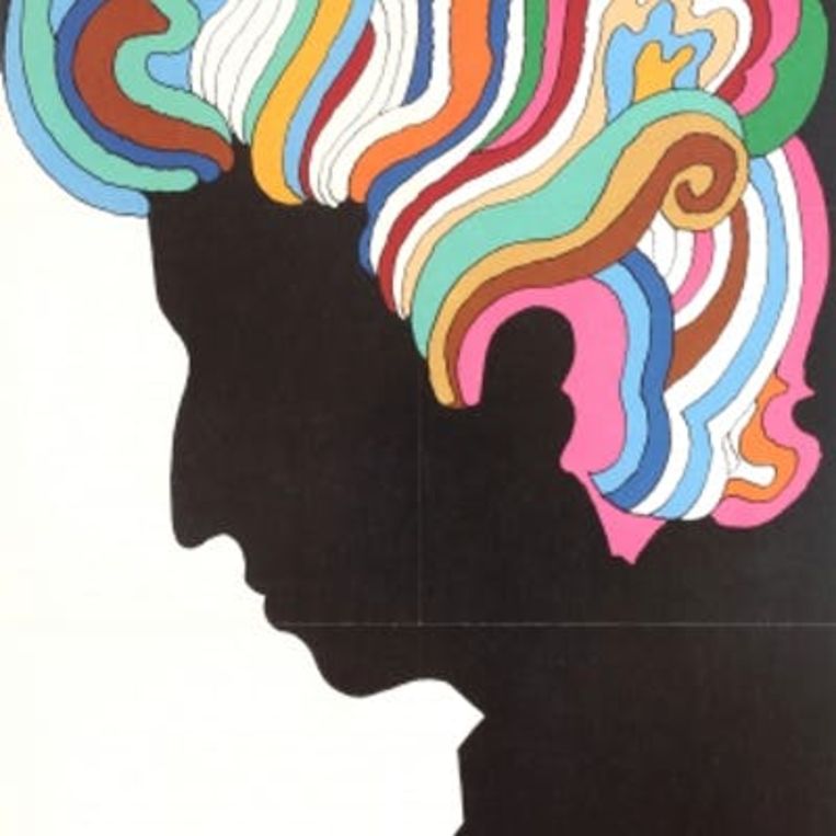
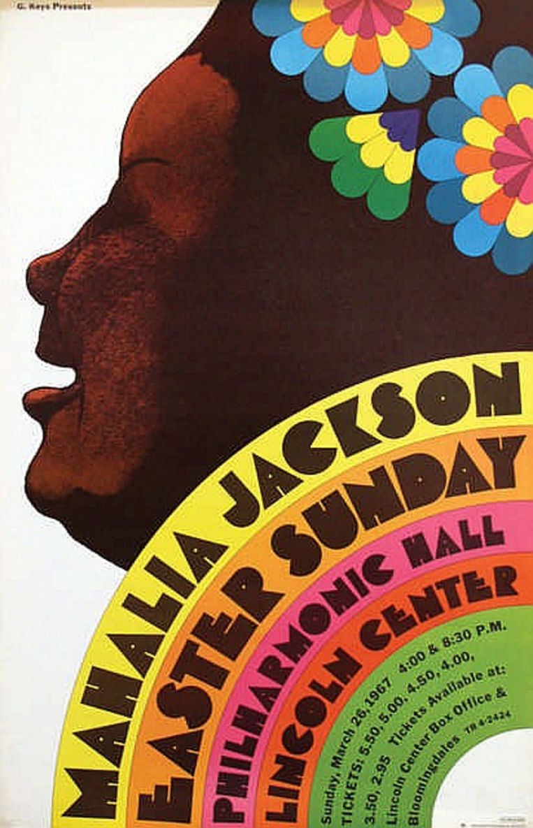
Of all the hundreds of posters he made, Bob Dylan’s from 1966 is the most famous. The young singer is visible in black profile. On his head, wild hair curls up in a tangle of rainbow colors. It is a poster, as well as art, included in the collection of the Museum of Modern Art in New York.
It is to Glaser’s credit that he made those cheerful and elegant posters just as easily as a simple, powerful logo. Glaser, born of Hungarian-Jewish immigrants, was a glutton when it came to style ideas. The color and humor in his work was a reaction to the strict and sober modernism of the time. But he borrowed just as easily from Bauhaus as he did pop art, from Italian Renaissance painters like Art Nouveau.
Emotional load
I❤️NY has been important to the development of the design profession because it underscores the power of visualization. When Glaser was commissioned by the city, there was already a slogan: I Love New York. What Glaser did is turn the sentence into a logo: It’s not words, but it’s a message nonetheless. And the heart gives the message an emotional charge that lacks the meaning. It pumps life into it and above all it radiates optimism that the city could use very well at that time.
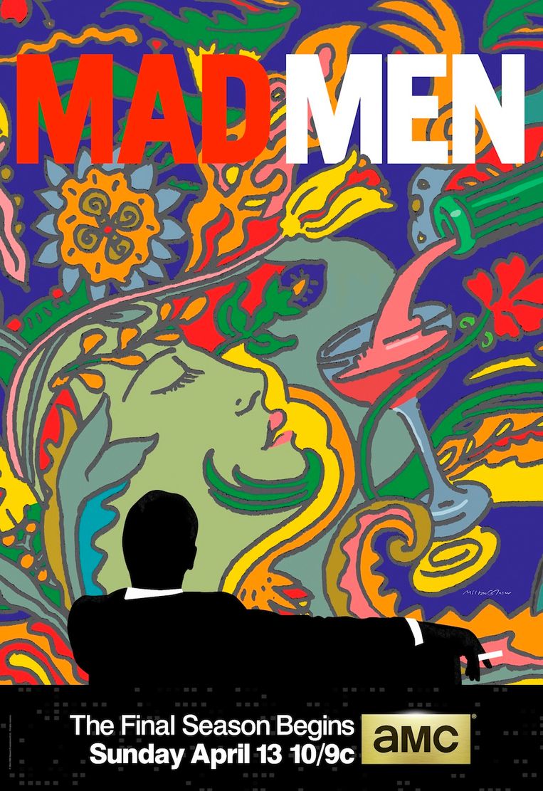
Glaser’s connection to the city is deep: he founded New York Magazine in 1968, which still bears his logo, and had his own design studio there since the early 1970s. Perhaps he was not a pure advertising man – although for the successful series Mad Men would make ads. But he did know what communicates. When the founders of Brooklyn Eagle Brewery came to him in the 1980s, he asked, “What do you need that eagle for, if you already have Brooklyn?” The eagle went out and the logo became a frothy, fat, friendly B. Because they had no money, Brooklyn Brewery paid Glaser in stock, now worth millions.
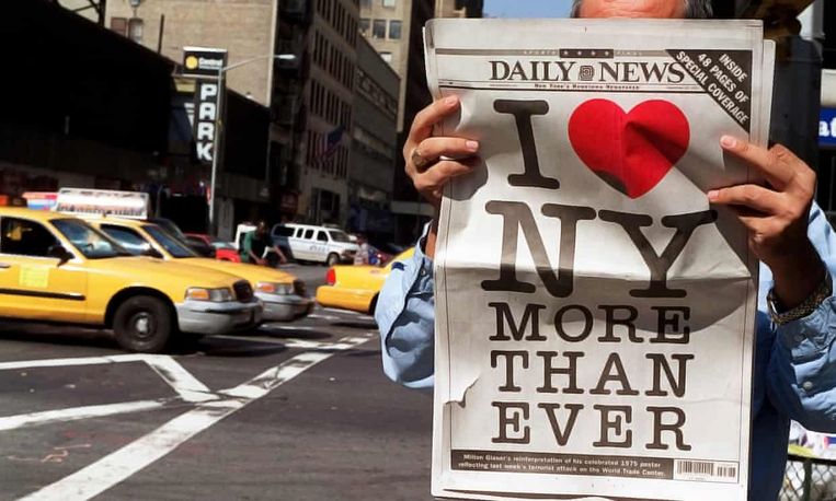
Glaser has said, “There are three possible reactions to a design: Yes, no, and wow. Wow is what I’m aiming for.’ That wow effect was also there when he remade his famous city logo in 2001, after the Twin Towers fell: I❤️NY MORE THAN EVER. The lower left side of the heart is slightly dented. It was another striking representation of the resilience of the city where he lived, worked and passed away this weekend at the age of 91.
–
:quality(80)/cdn-kiosk-api.telegraaf.nl/e7858e72-7dbc-11ec-b73f-0255c322e81b.jpg?resize=150%2C150&ssl=1)
