iOS Wallpapers: A Visual History of Apple’s Design Evolution
A circulating image shared by the Apple Club account has highlighted the evolution of iOS operating system backgrounds over the years, a visual journey reflecting Apple’s design philosophy, which combines simplicity with the distinct visual identity of each release.
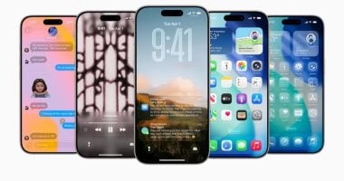
The image showcases a collection of official backgrounds beginning with iOS 8 and extending to newer versions like iOS 18, revealing a gradual shift from realistic imagery such as waves and nature in iOS 8, iOS 9, and iOS 10, to more abstract and smooth designs in subsequent releases.
iOS 11 Features
With the launch of iOS 11, Apple began leaning towards using high-resolution natural images, before gradually transitioning to backgrounds with gradient colors and artistic designs as seen in iOS 13 and iOS 14. This reflects a move towards simplicity and a focus on highlighting user interface elements.
In iOS 15 and iOS 16, a clear development emerged in the use of dynamic colors and visual depth, particularly with the introduction of features like “Dark Mode” and wider Lock Screen customization. This made backgrounds play a larger role in the daily user experience.
In the latest versions, such as iOS 17 and iOS 18, the backgrounds appear more vibrant and fluid, with greater reliance on color gradients and three-dimensional designs. This reflects Apple’s trend of integrating aesthetics with functionality, especially with updates related to artificial intelligence and smart customization.
Design experts believe that iOS backgrounds are not merely aesthetic images, but are part of the system’s identity, with each version reflecting Apple’s philosophy at that stage, whether in terms of innovation or user experience.
This continuous development opens the door for users to choose a background that expresses their personality, at a time when smartphones have become an extension of each individual’s digital identity.