
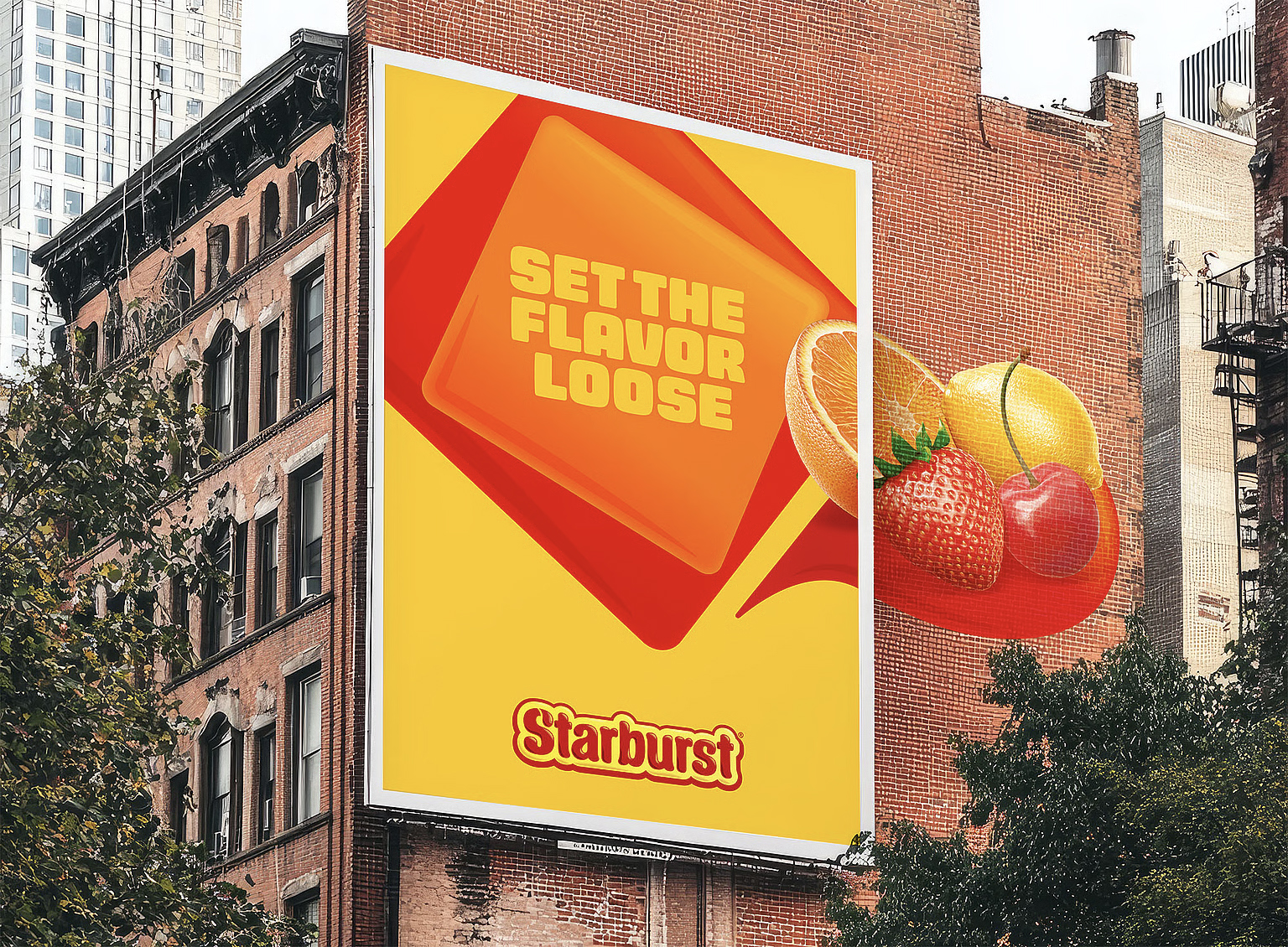
Starburst‘s iconic packaging has undergone a vibrant refresh, unveiled this week by design agency Straight Forward.The update marks the candy brand’s first major visual overhaul in years, aiming to amplify its playful personality while retaining the nostalgic appeal that has made it a confectionery staple.
The rebrand, commissioned by Mars Wrigley, centers on bolder color palettes, simplified typography, and more prominent fruit shapes-all designed to evoke a sense of juicy, optimistic energy. Straight Forward deliberately avoided a radical departure, instead focusing on refining existing brand elements to reinforce Starburst’s core identity. This approach reflects a growing trend among heritage brands to subtly evolve rather than wholly reinvent themselves, recognizing the value of established recognition.
According to Creative Bloq, Straight Forward’s work exemplifies “extracting a brand’s essence to reinforce, rather than replace its identity.” The agency’s design choices emphasize the fruit flavors, with each candy now visually linked to its corresponding fruit. The updated packaging also features a more streamlined layout, improving shelf visibility and consumer engagement.
The refresh extends beyond the wrappers, encompassing Starburst’s digital presence and marketing materials.Mars Wrigley intends the revitalized brand image to resonate with both long-time fans and a new generation of consumers, ensuring Starburst remains a relevant and beloved treat for years to come. Further branding insights can be found in Creative Bloq’s coverage of rebranding versus refreshing brand identities and the rise of “quiet rebrands” in 2025.