traffic
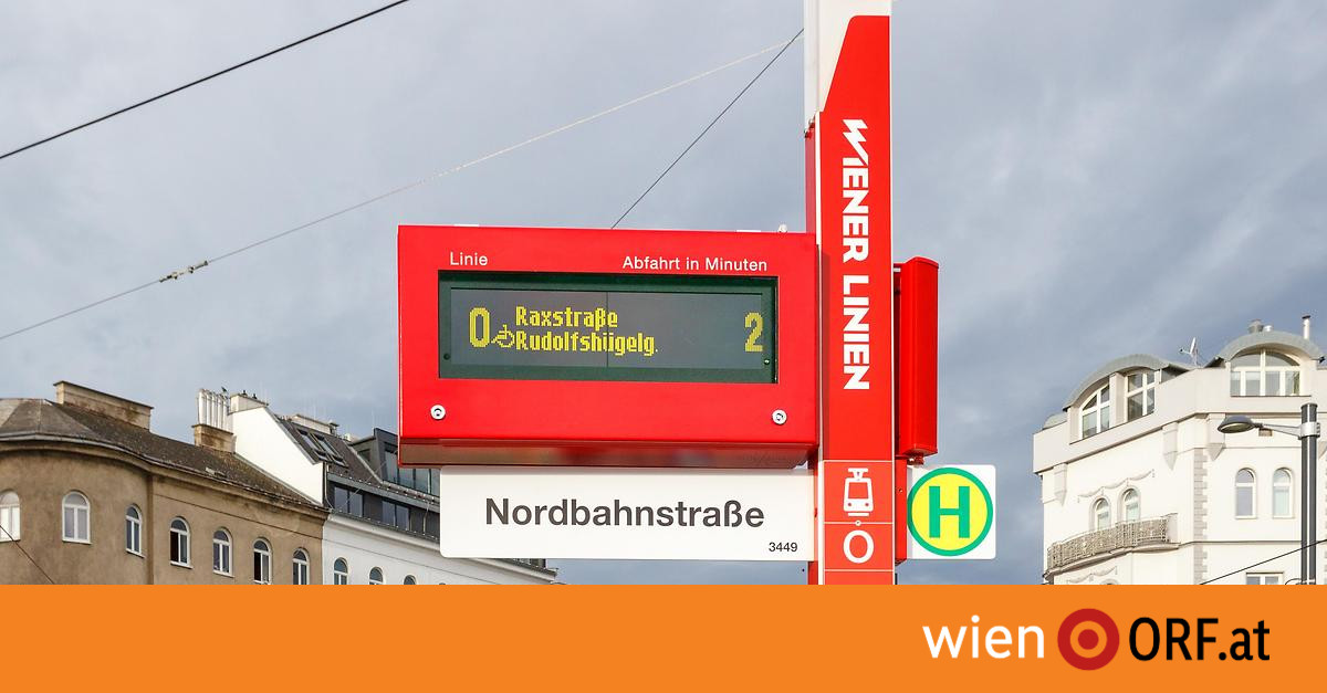
It is a long-term project by Wiener Linien: The tram and bus stops are getting a new design. There are now around 30 new stops. The concept has now been renewed again – instead of dark blue, the focus is now on bright red.
17.12.2020 05.02
Online since today, 5:02 a.m.
–
–
–
At the first design presentation in October 2018, the bus stop mast was still a dark blue – as with many old bus stops. A spokeswoman for Wiener Linien told wien.ORF.at.
The red color and a white “contrasting stripe” would ensure better visibility – and thus even more accessibility, said the company spokeswoman. There are also a few of the new stops in blue, they should be replaced.
Photo gallery with 3 pictures


–
Sometimes the timetable is no longer on paper
The 30 or so newly designed stops are located on the extended stretches of tram lines D and O, on lines 6, 11 and on the new route on bus line 13A. At first, the company concentrated on construction projects for which new stops were needed anyway – all the stops are now to be renewed “successively”, according to the Wiener Linien spokeswoman. That will take several years.
Timetables and area maps are now shown in A3 format – and thus twice as large as before. Some of the plans can no longer be seen on paper but on an ePaper screen that is not touch-sensitive. Four views can then be selected using a large button: location, route, timetable and useful information – available in German and English.
Dark background and light font for the visually impaired
If you press the screen button for a long time, you can also switch to a “two-sense mode”. The color display is reversed. The background is dark and the text is displayed light. The font is also enlarged. This representation can make it easier to read for the visually impaired. At the same time, however, the information displayed is also read aloud. The starting point for the redesign was an ideas competition that “Dottings – Industrial Design” won.
–
–

